Restaurants, bars, and hotels now produce beautiful eye-catching menus that encompass their brand’s values and ethos. Customers want to see your story in your documentation and many believe this is where the dining experience begins.
With a completely saturated market, venues are having to do everything they can to put their best foot forward. Promoting your brand will likely include developing fresh marketing materials as well as documents for inside the restaurants.
Logical, Chronological Sections
Your menu should be divided into clear sections, which customers can easily understand.
Each course should be grouped together. Usually, the main courses will offer the most choice, so creating further subcategories for your customers may be useful here.
Chronological order is imperative, as the menu should tell a story for the customer. Starting with nibbles and appetisers, and finishing with sweet treats.
You may, however, choose to break out of this mould to highlight special dishes you are encouraging the reader to indulge in. This is an excellent technique for grabbing the customers attention but should not be overused. Attempting to highlight too many dishes can cause the menu to lose all structure and become confusing.
Careful, Concise Copy
Striking the correct balance with dish descriptions is challenging.
The description must accurately reflect the dish, enticing the customer with just a short, concise statement. The snippet will generally include the key ingredients, highlighting any features that the chef believes the reader should be aware of.
Some venues use their descriptions tactically, giving the dishes they are pushing a more detailed and luxurious description.
Understand How Readers, Read
We do not open a menu and read as if it were a compelling novel.
Eaters scan the menu, often paying very little attention to the words. Our eyes gravitate to large text and headings, which is why a straightforward menu is so important.
Customers are surprisingly easily swayed, and through some intelligent positioning and bold text, you can persuade your readers into individual dishes.
It has been shown that customers gravitate towards the top right corner of menus. Putting your special dish in the space, in a slightly larger font, can give customers the convincing nudge to choose this plate.
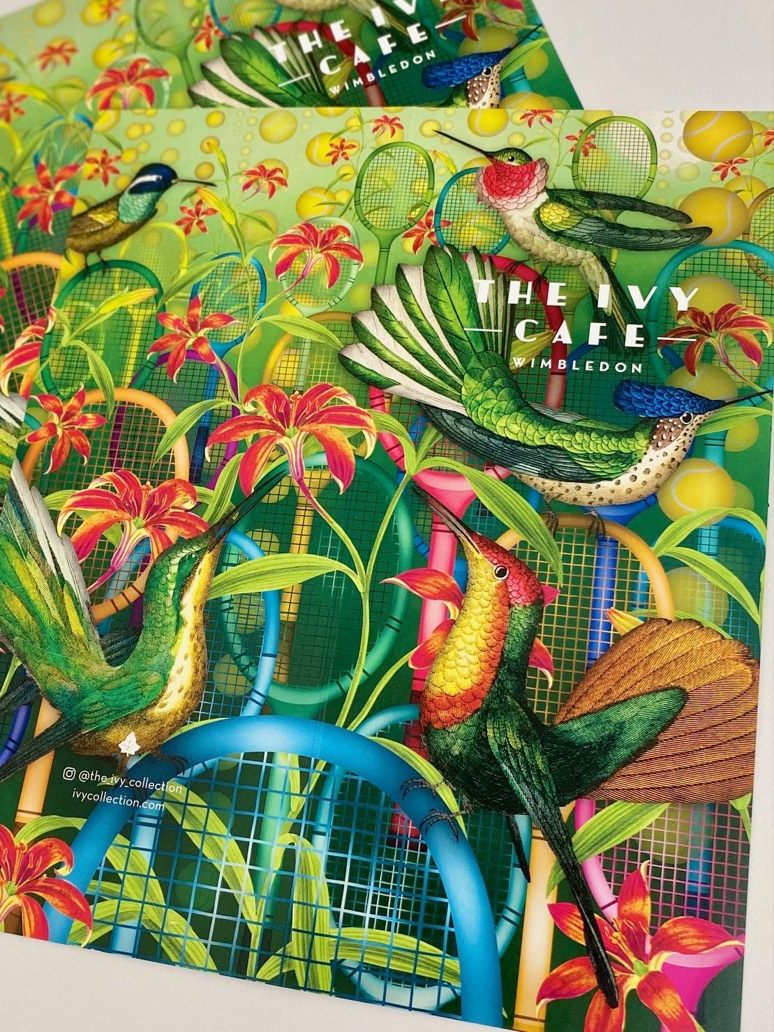
Consider Photography
Photos of dishes can give your customers an accurate representation of how their meal will be presented. However, photographs on menus, unfortunately, are often associated with lower-end and more budget restaurants.
Consider instead using illustrations. This is a great way of tying your menu to your restaurant's overall theme and can cleverly reinforce your brand identity. In the world of social media, people are constantly taking photographs and are often snapping away at the dinner table before enjoying a meal or drink.
Having an aesthetically pleasing menu means it is likely to feature in these shots, offering your brand an element of free exposure.
Clever Colours
Menus are all about psychology and understanding the customer.
So colour can be a tricky tool to master. It requires the perfect balance between choosing a colour to spark an excellent mood and one that represents your company branding.
The colours red and blue are thought to trigger appetite but should be used very carefully. If these colours contrast your company's brand entirely, it is worth omitting them and keeping a consistent theme that your customers recognise.
Consider the use of shades on a menu design. Using one colour in a range of different shades is a beautiful yet subtle way of emphasising branding whilst remaining simplistic, stylish and modern.
Omit Pound Signs
Have you noticed some of the most beautiful menus don't actually use currency signs?
Your customers understand that they will be spending in the local currency, so there is no need to include a pound sign before the price. This can also make the menu look much more eye catching.
Some reports also believe that omitting the pound sign helps to 'soften' the more pricey dishes. A tactic often used in more upmarket and expensive restaurants.
If you omit the currency symbols from your menu ensure it is consistent across the brand, removing it from drinks menus and any other documents.
White Space is Impactful
White space is a smart way to create division and highlight separate sections in your menu.
White space improves reader comprehension, as well as helping to create a much more modern overall finish.
There should be enough space around each separate dish, signifying where one description ends, and another begins. However, leaving a more significant gap between courses can be a creative way to create segregation without the need to add boxes and borders to the design.
Most of All, Be Yourself
Your customers want to see your personality in your menu.
We love something different, and many customers are bored of seeing the same design and colour schemes repeatedly. Customers enjoy a unique visual and will gravitate towards this over a design that has been replicated thousands of times.
Be playful with your ideas and allow the ethos of the brand to shine through. Creating a menu that mirrors the company values is ideal - customers will always value authenticity.
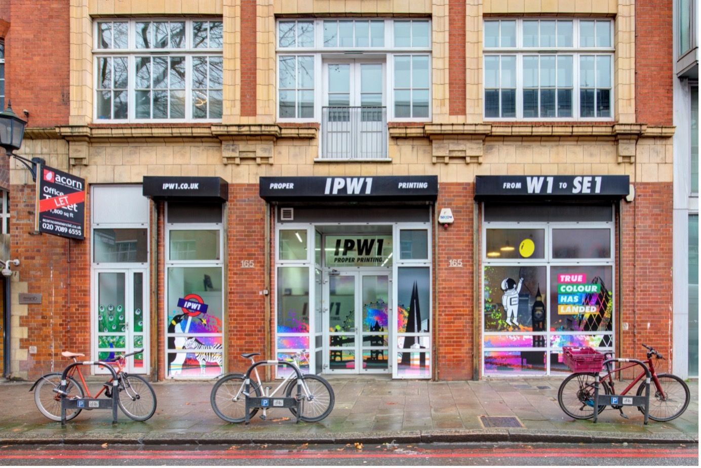
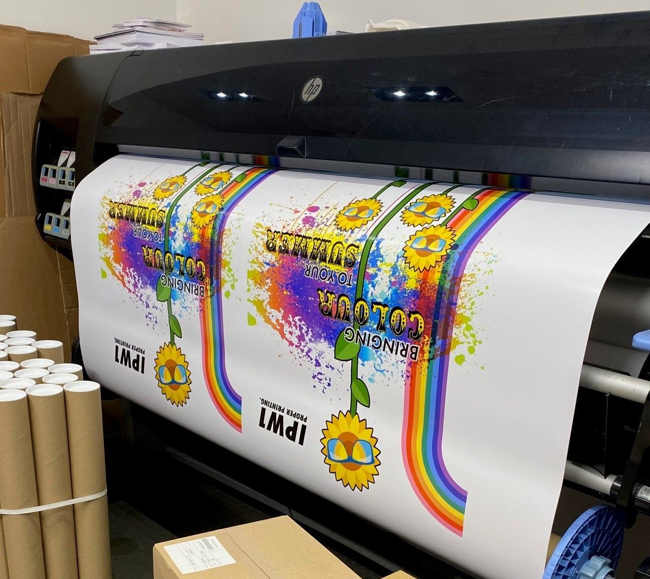
How IPW1 Can Help
IPW1 love bringing your menu designs to life. We work hard with customers to inject life into your beautiful creations, transitioning them into tangible documents ready to be handed to your eagerly awaiting customers.
We love working with businesses that value a comprehensive approach. Meaning, our printing services do not stop at menus and can be used to tie together your company's entire branding. From menus to coasters, as well as bill holders and gift cards, all your tableware requirements.
Simply contact IPW1 on 020 7437 3200 or email us at hello@ipw1.co.uk to discuss your options today.