Print marketing is still very much alive and kicking.
However, there are many mistakes business owners make time and time again, which ultimately detracts from their otherwise incredible designs.
What is Print Marketing?
Print marketing is the umbrella term for any advertisements that are physically printed.
Whilst there are considerable benefits to marketing your brand and business online, the best strategies tend to implement a delicate balance of digital and print to appeal to the broadest target audience.
Failing To Proofread
Grammar or spelling mistakes in marketing materials are a disaster.
They result in one of the following two scenarios.
Either, you notice the mistake just as your documentation is printed. Meaning, you have to head back to your laptop, amend the finalised design and send the work to be reprinted. This is a time consuming and expensive oversight.
However, the second scenario is even worse. The mistake is picked up by a potential customer, putting them off your brand altogether.
Of course, spelling mistakes are entirely natural. Just ensure you get a second or third pair of eyes to look over the work before sending it to print.
Missing White Space
White space is the key to excellent design.
Where marketing material contains too much information and imagery, it can become completely overwhelming for the reader. But be it a flyer, leaflet, or business card, empty space is a technique that will stand the test of time.
A minimalistic design that makes use of white space gives a polished, professional finish. In addition, it will make the information of the document hugely impactful.
Poor Print Quality
There is no point in wasting hours of your time researching and designing a marketing piece to shirk on the quality of the print.
For menus and business cards, consider adding a wow factor with some bespoke print finishing. This might include a laminated finish or foiled edges to elevate your design.
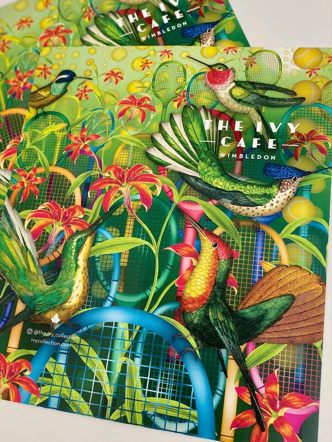
Using Low-Quality Imagery
Crisp, sharp, high-resolution imagery is essential for print marketing materials.
Some images look fantastic on screen, but the colours and formatting will not seamlessly transition to pint.
If you have concerns, discuss your images with your printer beforehand, who will be able to give you all the information you require.
Also, ensure that you use stock images carefully.
Stock images can be a great addition to your print marketing, allowing you to add graphics where you do not have the time to hire a photographer or illustrator. However, overusing them can lead your materials to look identical to other companies.
Not Hitting the Target Audience
Many incredible designs simply fail to deliver to their target audience.
Consider your ideal customer and research your competitors. Then, take inspiration from their work, thinking about the most appealing elements to your dream client.
Remember, you would not target a group of new parents the same way you would target those who have long since retired. So, ensure your marketing is appealing to the appropriate group.
No Bleed
‘Bleed’ is printing that goes beyond the area where the print will be trimmed.
It is essential for marketing tools such as flyers and brochures but should also be used for menus and many other elements of your print marketing strategy.
Without a proper bleed, there will be a thin white border around the edge of your design, which can potentially spoil the whole aesthetic.
The bleed required is generally 3mm but can rise to 7mm for some designs. Our dedicated team at IPW1 will discuss this with you before sending your designs to print.
Missing The Mark with Colours
First, the design should incorporate your brand colours.
However, there is much more to individual colours than whether they pair with your logo.
For example, red symbolises danger and urgency, meaning it can be used cleverly yet carefully in marketing materials. On the other hand, blue connotates tranquillity which may have the aesthetic you prefer but might lack the power to grab your readers attention.
Also, take time to consider which colours complement each other. As a general rule, refrain from using more than one primary colour per document. There are many handy tools that show which colours pair together for maximum accessibility.
Forgetting A Call to Action
Your call to action should be at the forefront of your mind when designing your print marketing.
Consider what the purpose of the material is and ensure that it is clearly conveyed to your audience.
For example, if the purpose of your flyer is to drive customers to your website, then your website address should be the biggest font on the document.
Conversely, if you are encouraging customers into a physical store, then the address should be the standout text. Adding a discount coupon onto the document will also dramatically help with driving customers to your store.
Unclear Branding
Perhaps the biggest mistake in print marketing is when the company fail to represent their brand in the idea.
Regardless of how clever, witty, or eye-catching the work is, if it is not abundantly clear that it represents your company, then the piece has failed.
Your company name, colours and logo should be instantly recognisable, regardless of what the marketing piece is.
Failing to Invest in The Right Tools
If you are designing the idea yourself rather than hiring a design agency, investing in the right tools is crucial.
Adobe Illustrator and Photoshop are the firm favourites and offer a pretty much unlimited scope regarding your creations. The annual fee for the Adobe Suite is a significant outlay. However, it can be paid monthly and will be a substantial asset to your company.
Whichever program you decide to choose, remember to spend some time practising before finalising any design.
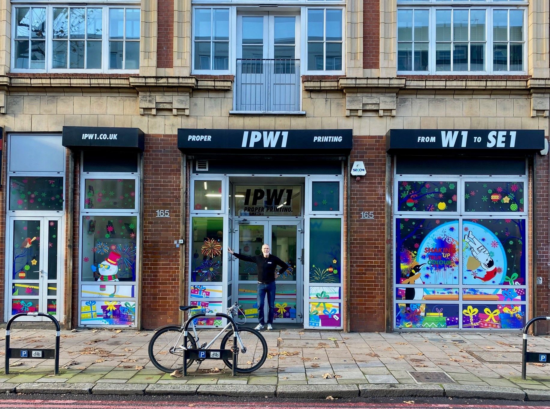
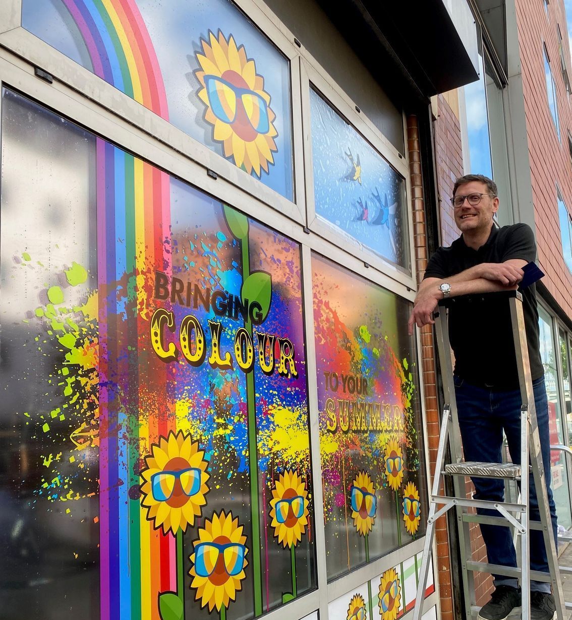
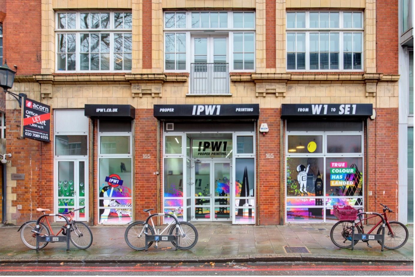
How IPW1 Can Help
IPW1 are printing experts.
We specialise in bringing your marketing dreams to life, regardless of the scale of your project.
For more information, contact IPW1 on 020 7437 3200 or email us at hello@ipw1.co.uk.